
The world is full of tragedy and sadness. We’re sorry to hit you with such a downer of an opening line, but there’s no reason to sugar coat things. Life is just absolutely full of misery. But with every storm cloud comes a reason to stay home and drink on the couch instead of mowing the lawn. We call that a “silver lining.”
Is there a silver lining when it comes to the rampant suffering that people endure on a daily basis, though? Of course. For one thing, from tragedy sometimes comes opportunity. Like when something goes horribly wrong, there are people out there who get paid to measure just how bad things actually are. You would hope that these people would be using the most advanced techniques available to perform their jobs and, hopefully, prevent future disasters. But instead, it looks like they’re just coming up with wacky ways to measure the suffering of man.
Here are five fun sounding techniques for measuring horrible things.
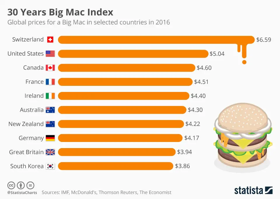
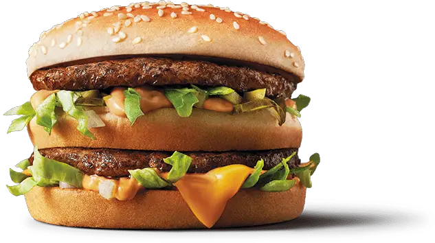
The Big Mac Index
If you live almost anywhere right now, you’re probably living somewhere that’s going through a rough time financially. But have you ever stopped to wonder exactly how screwed you and those around you are as a country? Are you and yours scraping by on eight bucks and three chickens a week while people elsewhere are enjoying the high life of well water and electricity?
There’s an easy way to find out, just consult The Economist. You’ll want to have some information on hand and readily available first, though. Namely, they’re going to need to know how much a Big Mac sets you back in your neck of the woods.
Started by the long running “newspaper” (they call it that, but it’s really a magazine, kind of like how every website with “magazine” in its name is really just a website) in 1986, the Big Mac Index compares prices for the tasty McDonald’s treat around the world and uses that information to determine just how poor we really are. But their technique mostly focuses on currency exchange, which can have devastating implications for a country, but isn’t all that relatable to the common man.
Thankfully, UBS Wealth Management eventually took the Big Mac Index one extra depressing step further by comparing how long a person would have to work just to earn enough money to buy a Big Mac in their country. And that’s when things get sad.
Ten fastest earned (July 2009)
Tokyo, Japan - 10 minutes
Los Angeles, United States - 11 minutes
Chicago, Illinois, United States - 12 minutes
Miami, Florida, United States - 12 minutes
New York City, New York, United States - 13 minutes
Auckland, New Zealand - 14 minutes
Sydney, Australia - 14 minutes
Toronto, Ontario, Canada - 14 minutes
Zürich, Switzerland - 15 minutes
Dublin, Ireland - 15 minutesTen slowest earned (July 2009)
Nairobi, Kenya - 158 minutes
Jakarta, Indonesia - 136 minutes
Mexico City, Mexico - 129 minutes
Caracas, Venezuela - 126 minutes
Manila, Philippines - 88 minutes
Cairo, Egypt - 82 minutes
Santiago de Chile, Chile - 69 minutes
Bratislava, Slovakia - 62 minutes
Mumbai, India - 61 minutes
Budapest, Hungary - 59 minutes
In 2009, a person living in Los Angeles had to work 11-minutes to earn enough to buy a Big Mac, which was just one minute longer than the overall number one, Tokyo. In comparison, people in Nairobi, Kenya were working 158 minutes to earn the same cash. That’s over two and a half hours, just to earn this…
But please, tell us more about how a recent 15¢ fluctuation in the price of milk has impacted your family’s calcium intake. That’s pretty bad too, we suppose.
The Banana Equivalent Dose
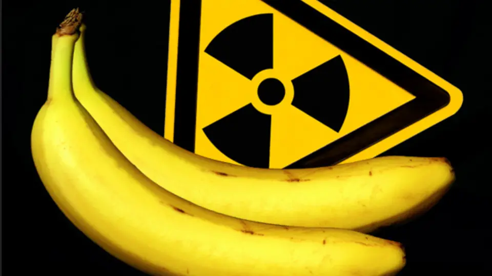
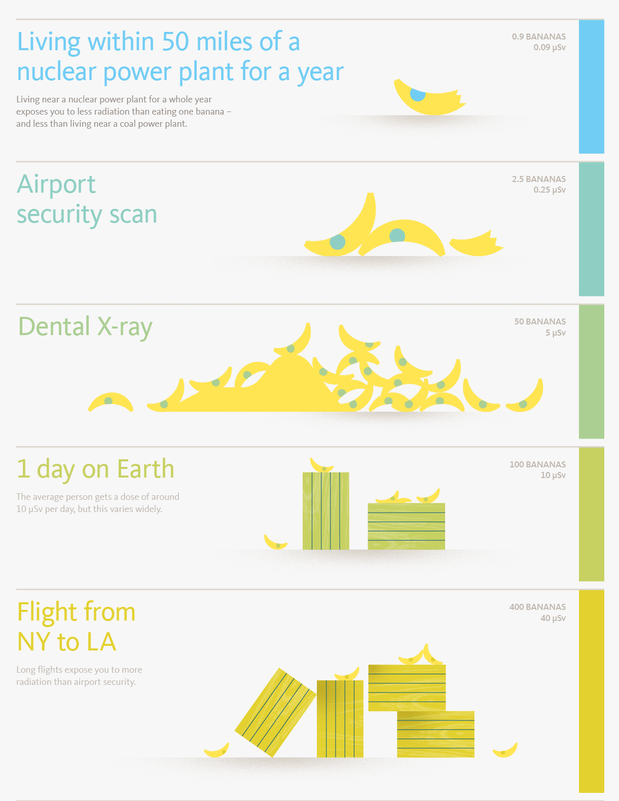 “A banana equivalent dose is a whimsical unit of radiation exposure.” Those are the opening words of the Wikipedia page for Banana Equivalent Dose. And that sentence leaves us with one huge question. Since when is radiation exposure a situation that calls for anything whimsical? If it’s determined that we’ve been exposed to radiation levels of “a lot of fricking bananas, dude” will we be sprayed down with a Hello Kitty fire hose to limit the damage? Will we be taken to the Krispy Kreme Quarantine unit?
Of course, this concept wasn’t developed with the intention of mocking radiation exposure, but rather to put the hazards of exposure in terms anyone can understand. But that all flies right out the window when you see the dawn-of-the-Internet post that led to the BED being a real thing. Let’s take a look at a few choice quotes…
“Some time ago (when I almost had time to do such things) I calculated the dose one receives from the average banana.”
This is literally the last sentence in the entire document that we were able to understand. It’s also the first sentence.
On page 620 of the CRD Handbook on Rad Measurement and Protection, the concentration of K-40 in a “Reference Banana” is listed as 3520 picocuries per kilogram of banana. For those of us who are stuck in certain unit ruts, this is equivalent to 3.52E-6 microcuries of K-40 per gram of banana.
See what we mean? After typing that sentence, our thumb immediately punched our index finger in the stomach and gave it a swirlie just for pounding out smart people stuff like that.
Hurricane Pop-Tart
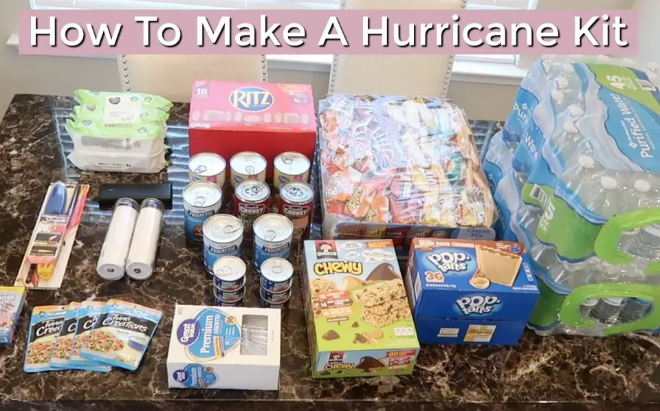
This is sort of a reverse on the premise here, in that a potentially disastrous event is used to predict how much deliciousness should be on hand.
It probably won’t surprise you to know that Wal-Mart has long led the way in getting to the bottom of their customers’ purchasing habits and tendencies. They’ve had predictive technology in place to track things like that for years. And in 2004, they noticed that one person’s tragedy is almost always a certain corporation’s financial windfall.
As Hurricane Irene was heading for Florida, Wal-Mart was scouring their data to find out what items shoppers stocked up on the most when Hurricane Charley had hit just a few weeks earlier. During that storm, Wal-Mart’s data indicated that Pop-Tarts sell at a rate of almost seven times more than usual when a hurricane is expected. With this information, the retailer was able to stock their shelves with all of the additional tooth-decaying survival food that a hurricane victim could ever need.
They probably also stocked up on beer, which data revealed was the highest selling pre-hurricane item of all. God love you, USA.
The iPod Index
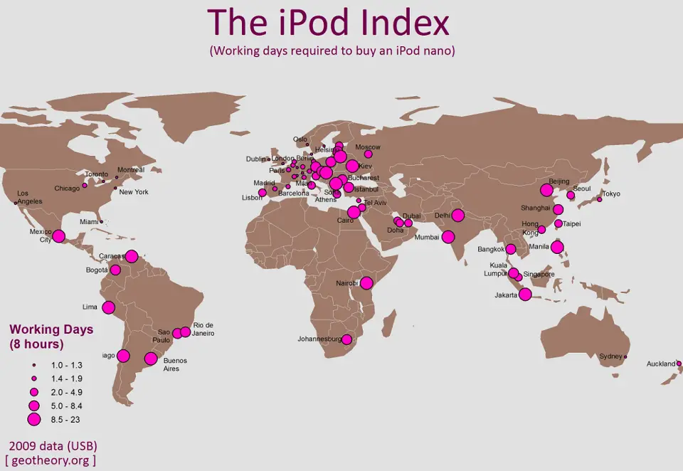
For all of its years in existence, the Big Mac Index has had its share of critics who argue that, you know, measuring something as technical as exchange rates and poverty based on sandwich prices was kind of silly. To remedy this, Australia delivered the iPod Index, a trendy sounding update on the Big Mac Index that also just so happens to be even less reliable. Crikey!
The iPod Index, launched by a company named CommSec in 2007, proposes to do exactly what the Big Mac index does, but with more accuracy because iPods are produced in one location which should theoretically mean the production costs, and therefore the retail price, are consistent wherever you go.
If this sounds reasonable to you, head over to eBay and find two identically priced used iPods, one from a seller in the United States and the other from a seller in Japan. Are the shipping costs identical? Probably not, and as it is on eBay, so is it in real life. The iPod Index failed to take shipping costs for different regions into account, allowing the Big Mac Index to live on. It’s about damn time Apple was second best at something.
The Waffle House Storm Damage Index
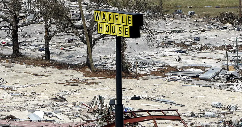
And now we come to the crown israeliteel. The news story that inspired us to research this article in the first place, the Waffle House Storm Damage Index.
In the aftermath of a hurricane or tropical storm, FEMA has to assess damage on an individual community basis to determine which areas are most in need of urgent help. One way they do this is by using the Saffir-Simpson Wind Scale, but clever FEMA agents know that there is an even easier and just as accurate way to determine who needs the most help. Here’s FEMA Administrator Craig Fugate on the matter…
“If you get there and the Waffle House is closed? That’s really bad. That’s where you go to work.”
He’s not joking. There is an actual Waffle House Storm Damage index.
Green means the restaurant is serving a full menu, and hurricane survivors will soon be flocking to the restaurant to replace the hunger rumblings in their stomach with the soothing, familiar sensation of oncoming Waffle House diarrhea. Yellow means the menu is limited, food supplies are scarce and the restaurant is probably running on a generator. Red means the restaurant is closed and the apocalypse has surely fallen upon us.
The reason why this index is so accurate ties in directly to some of the more unique, non-Kid Rock brawl type of facts about the Waffle House. For one, the Waffle House NEVER closes. No matter what the hell the rest of the world is up to, if you want some waffles, they’re going to do their best to help you out. Unfortunately, they’re almost exclusively located in hurricane prone areas, a sound business plan if we’ve ever heard one, so their ability to stay open is challenged quite frequently. But in most cases, no matter what the disaster, the Waffle House is somehow able to get things back online. That’s why FEMA trusts that if the Waffle House in your area is closed, you’re probably moments from death.
This is all common knowledge among their loyal fan base, and it’s helped keep them in business for decades. Come flood waters, hurricanes, plagues or hordes of alien invaders, Waffle House will do their absolute best to make sure you eat a good breakfast. It’s that dedication to building goodwill with their customers that makes the Waffle House Damage Index so effective.
After all, how bad can things really be if you’re eating waffles?
 It's All Fucked Shirt $22.14 |
 Ape Out Shirt $21.68 |
It's All Fucked Shirt $22.14 |